Project Summary
Developed through Barrows for 3M Command at The Home Depot, this project reimagined how shoppers discover picture-hanging and organization solutions before, during, and after a store visit. The system connected digital inspiration with a modular family of in-aisle, endcap, and standalone displays designed to scale across stores nationwide.
My Role
As Display Designer, I helped translate the shopper strategy into retail concepts, environmental graphics, fixture layouts, and 3D visualizations across multiple seasonal and behavioral use cases.
Project Timeline
- Shopper Journey
Define who shops the category, what triggers the visit, and where confidence breaks down.- Retail Strategy
Build a system that attracts from a distance, engages at the fixture, and simplifies product selection.- Connected Campaign
Extend project inspiration and education into social, editorial, and how-to content.- Display Development
Apply the system across in-aisle bays, endcaps, promotional pallets, and standalone fixtures.
Understanding the Shopper
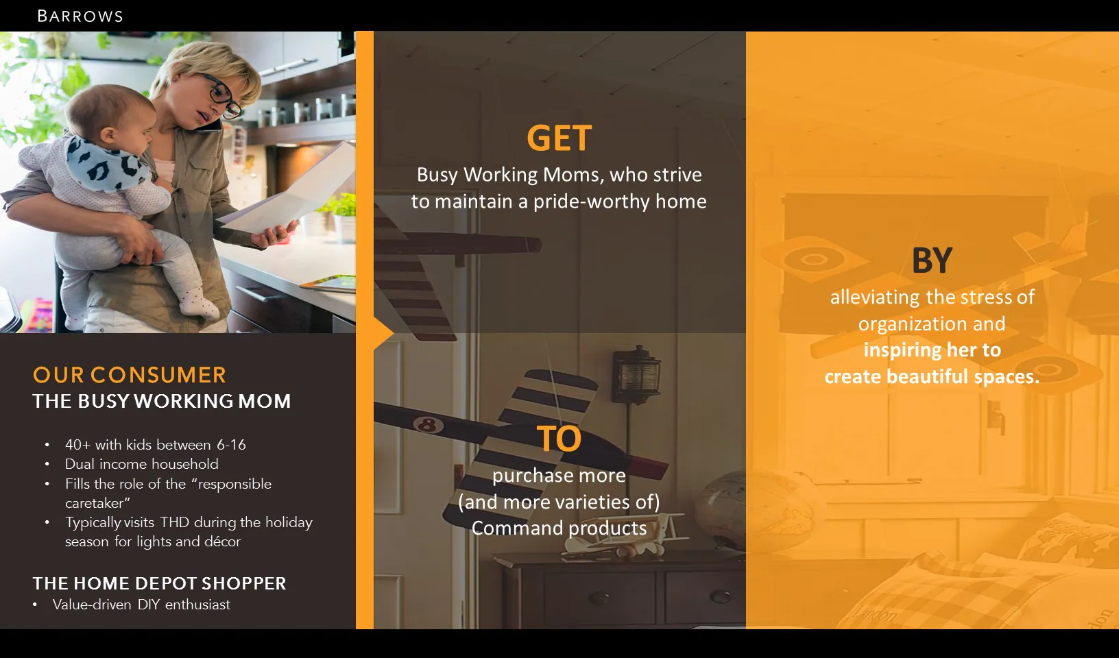
The core shopper was busy, project-driven, and often entered the category with a desired outcome rather than a specific product in mind. The experience needed to move her from inspiration to confidence: get her attention, help her understand why Command was relevant, and show how to complete the project.
The Existing Retail Environment
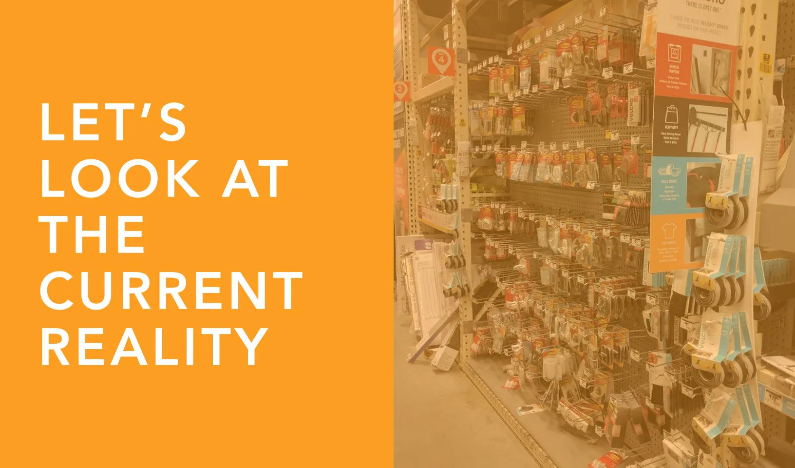
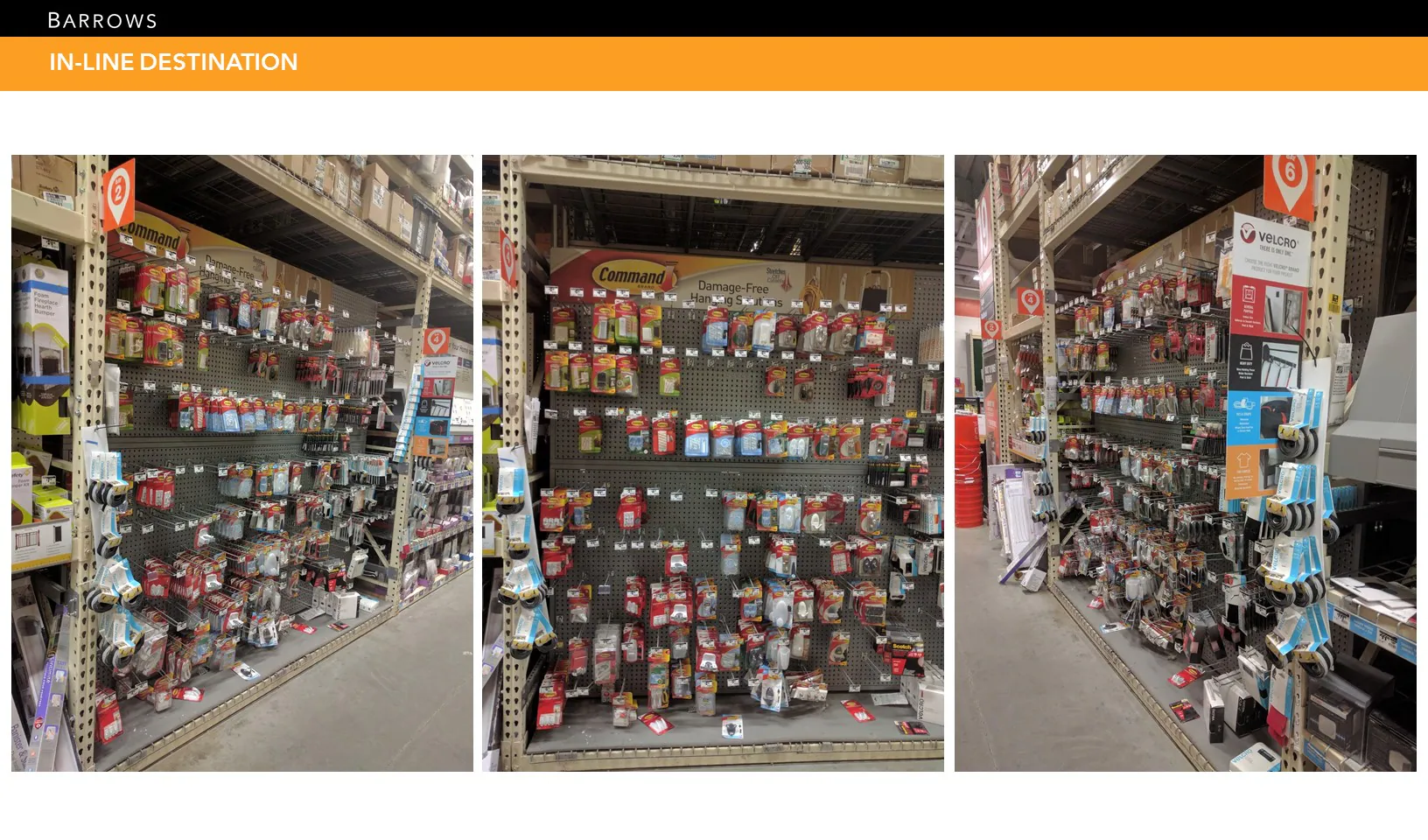
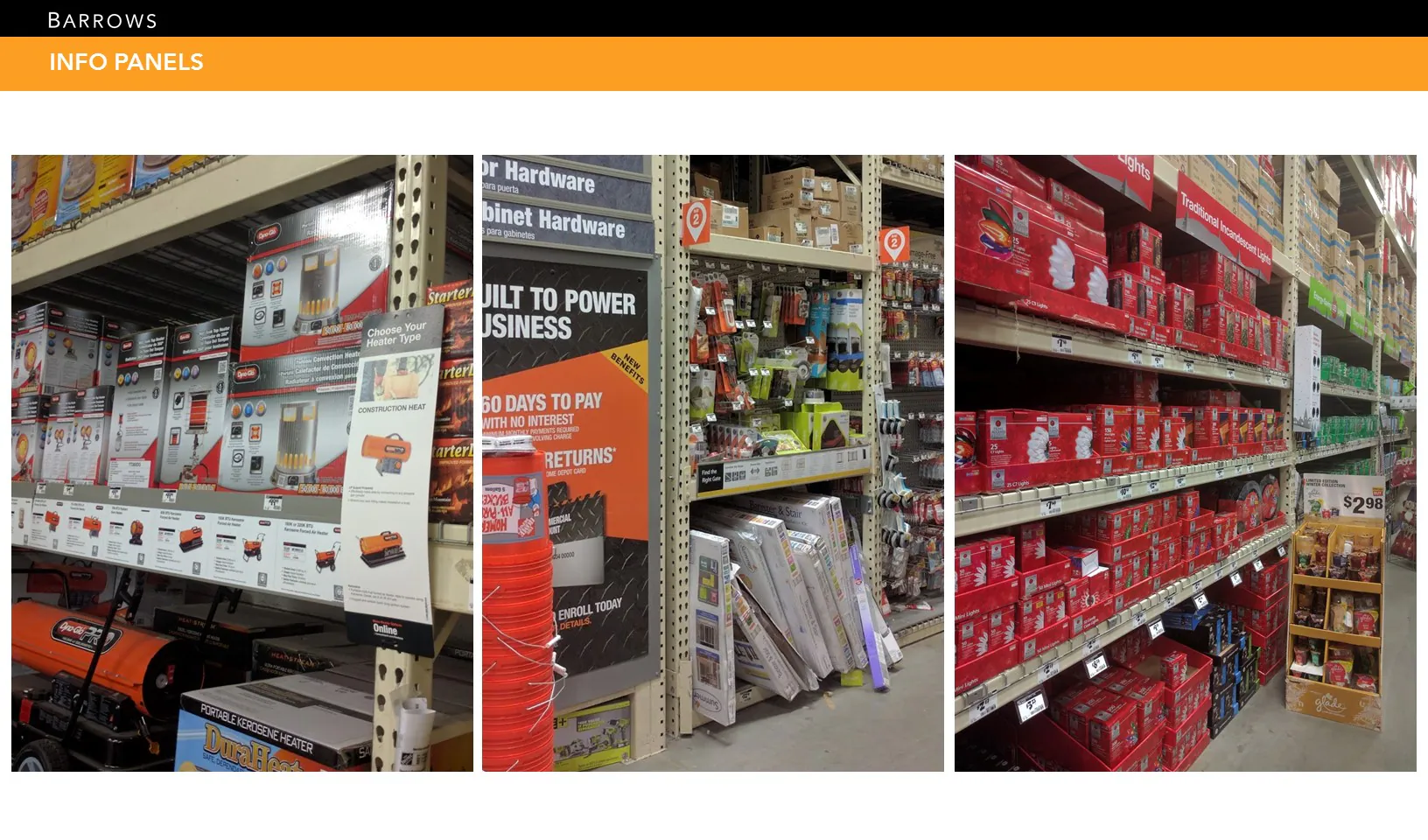
The category competed with dense packaging, hardware-led merchandising, large price communication, and inconsistent navigation. Reviewing adjacent bays and existing displays revealed an opportunity for a system that could communicate from the racetrack, explain at shelf, and still preserve product visibility.
Designing Across Distance
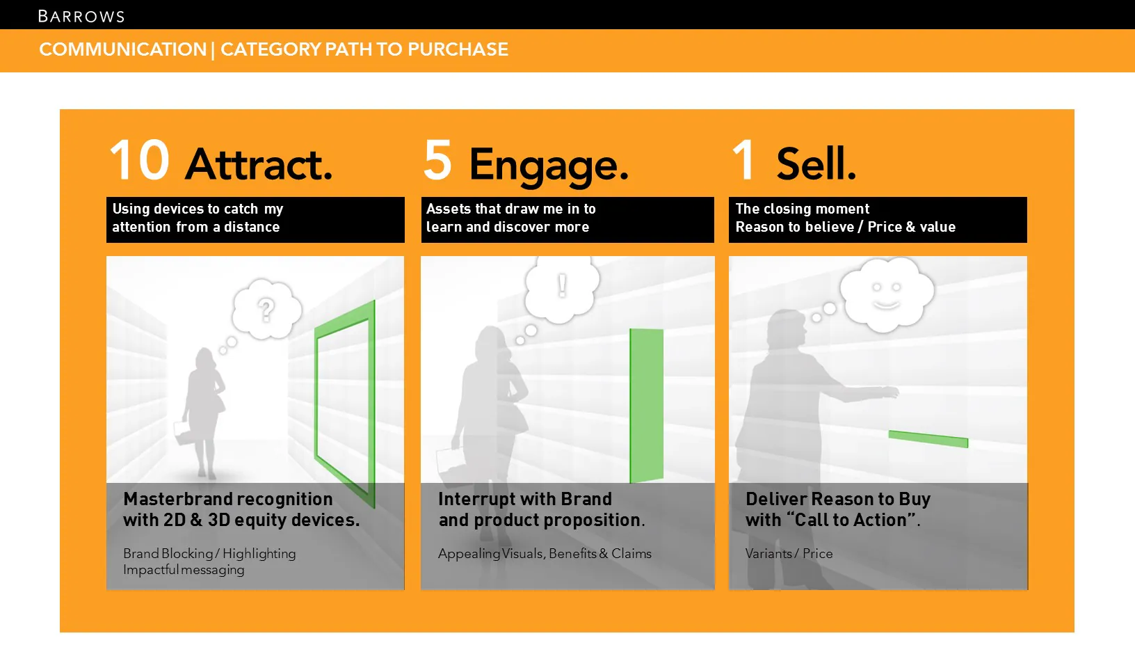
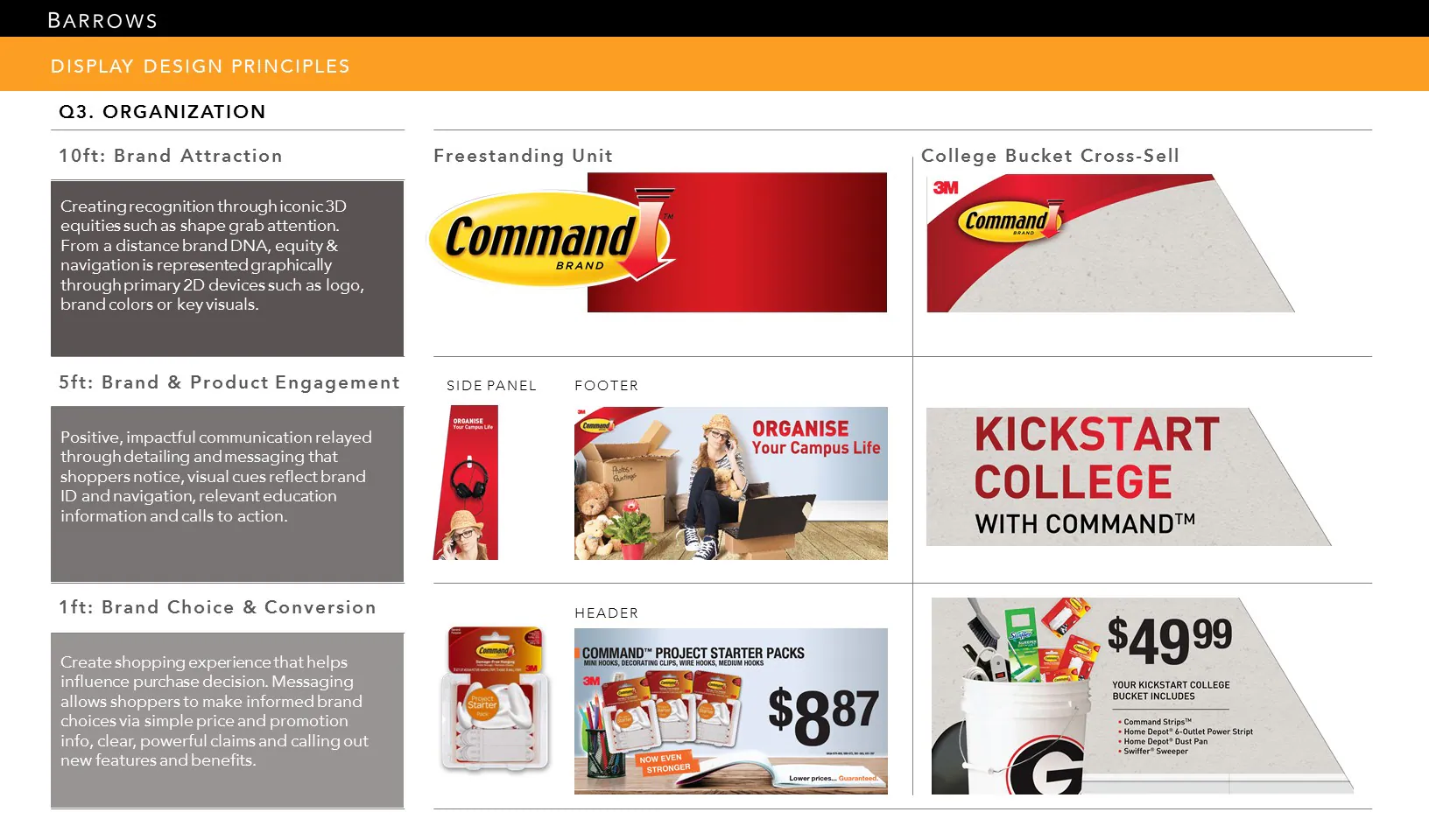
The design framework followed a simple retail hierarchy: attract from approximately ten feet, engage at five feet, and support the final choice at one foot. Each layer had a different job, from recognizable brand and project cues to education, price, and product conversion.
Visual and Verbal Direction
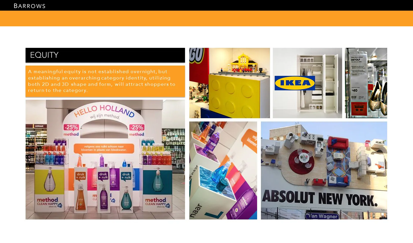
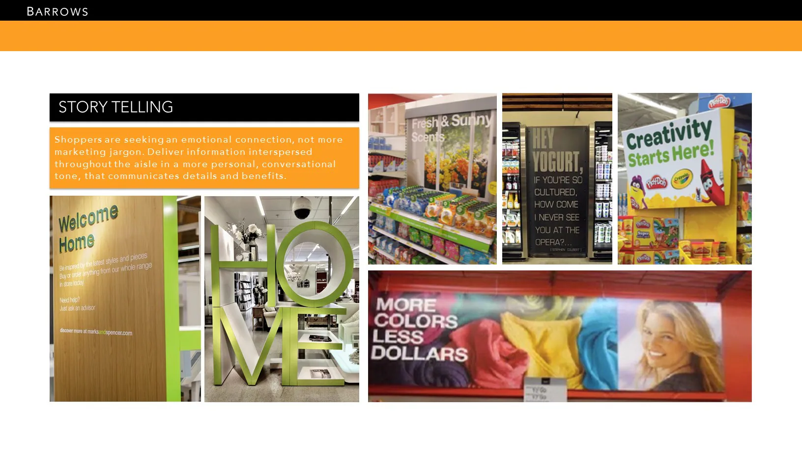
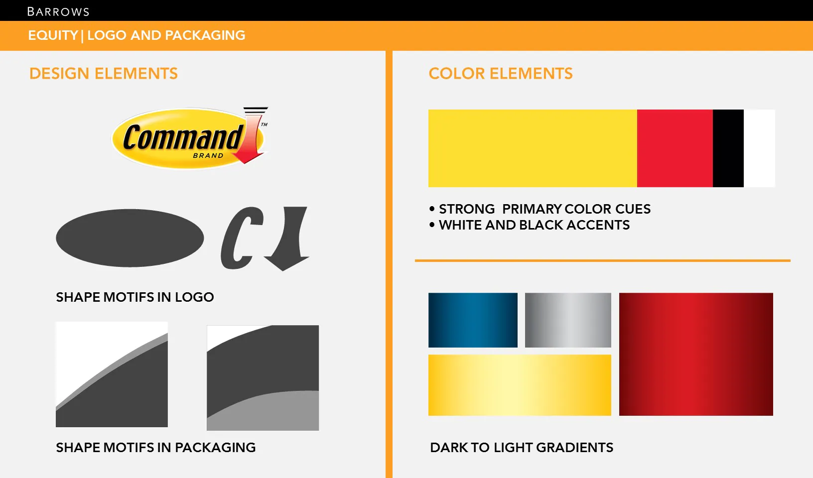
Research focused on brands and environments that combine strong equity with clear storytelling. The selected Command system used recognizable yellow, red, black, and white brand cues, supported by dimensional shapes and dark-to-light gradients derived from the packaging.
Connecting Inspiration to Store
Pre-store concepts turned common organizing and decorating needs into shoppable stories. Pinterest boards, social carousels, and how-to content gave shoppers a project entry point before directing them toward the relevant Command solution at The Home Depot.
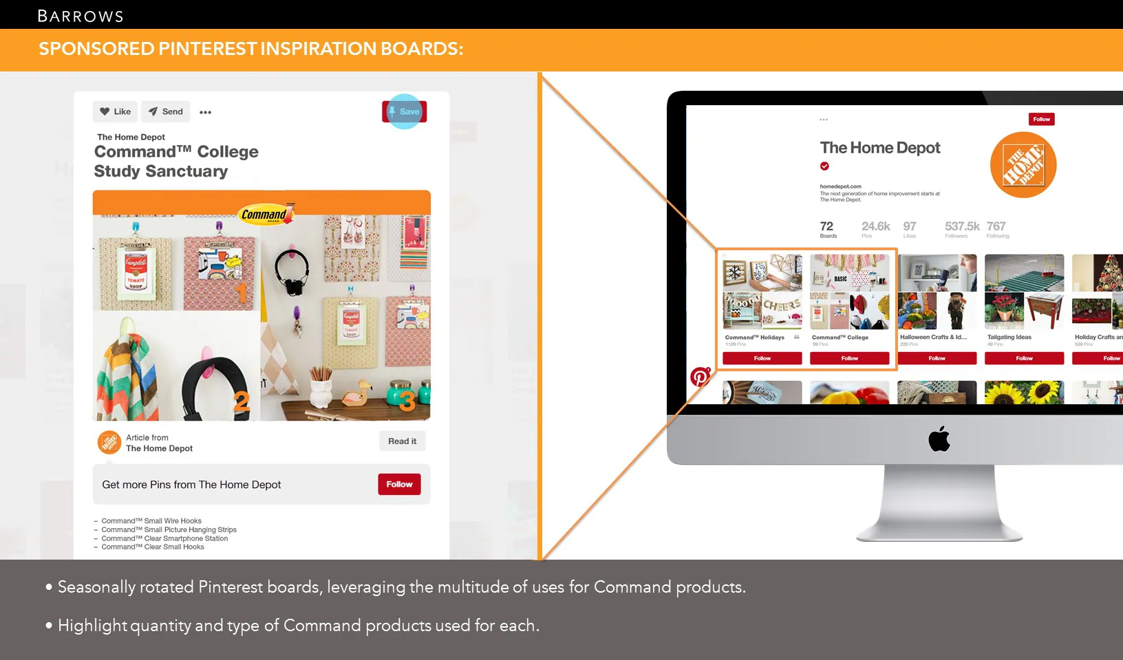
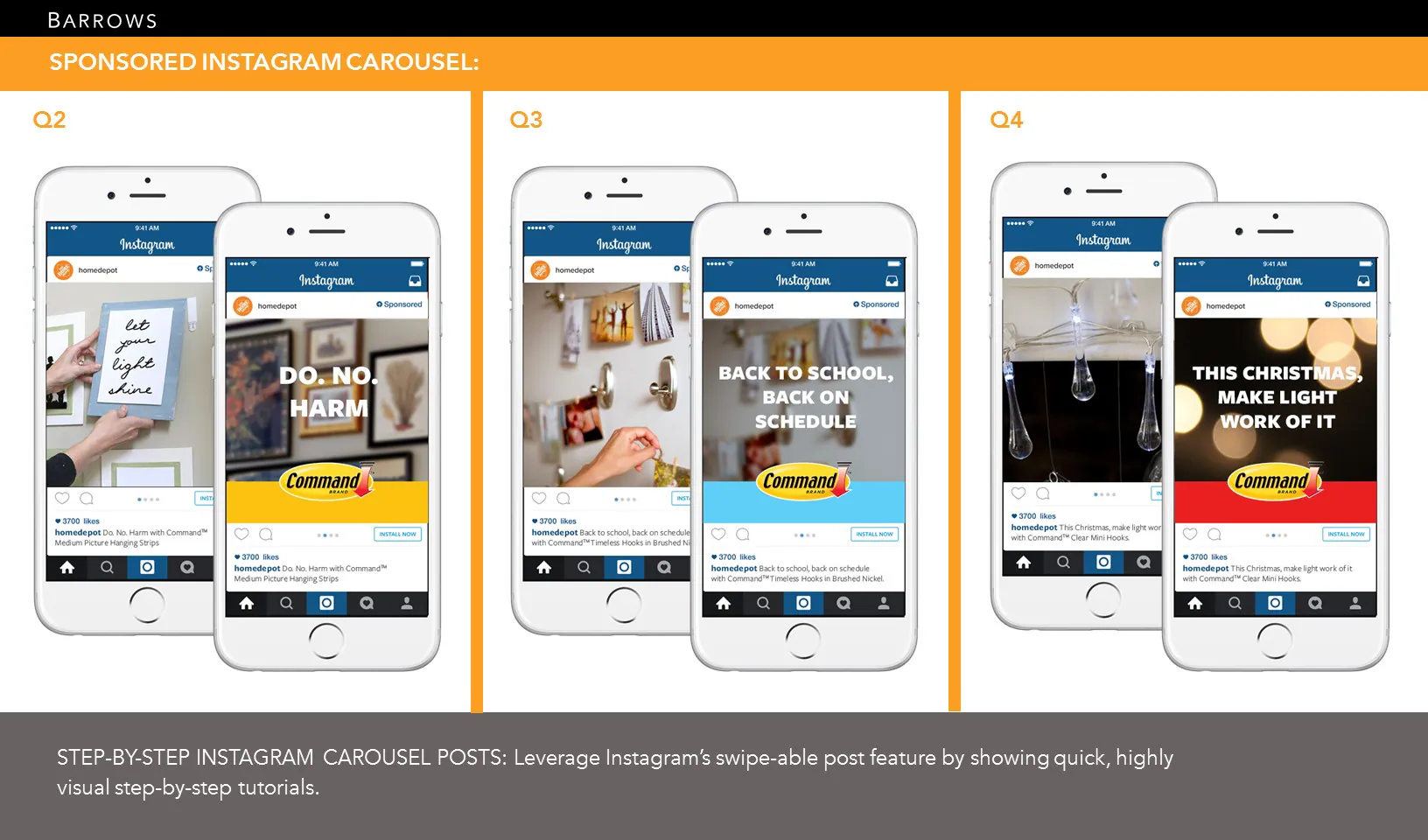
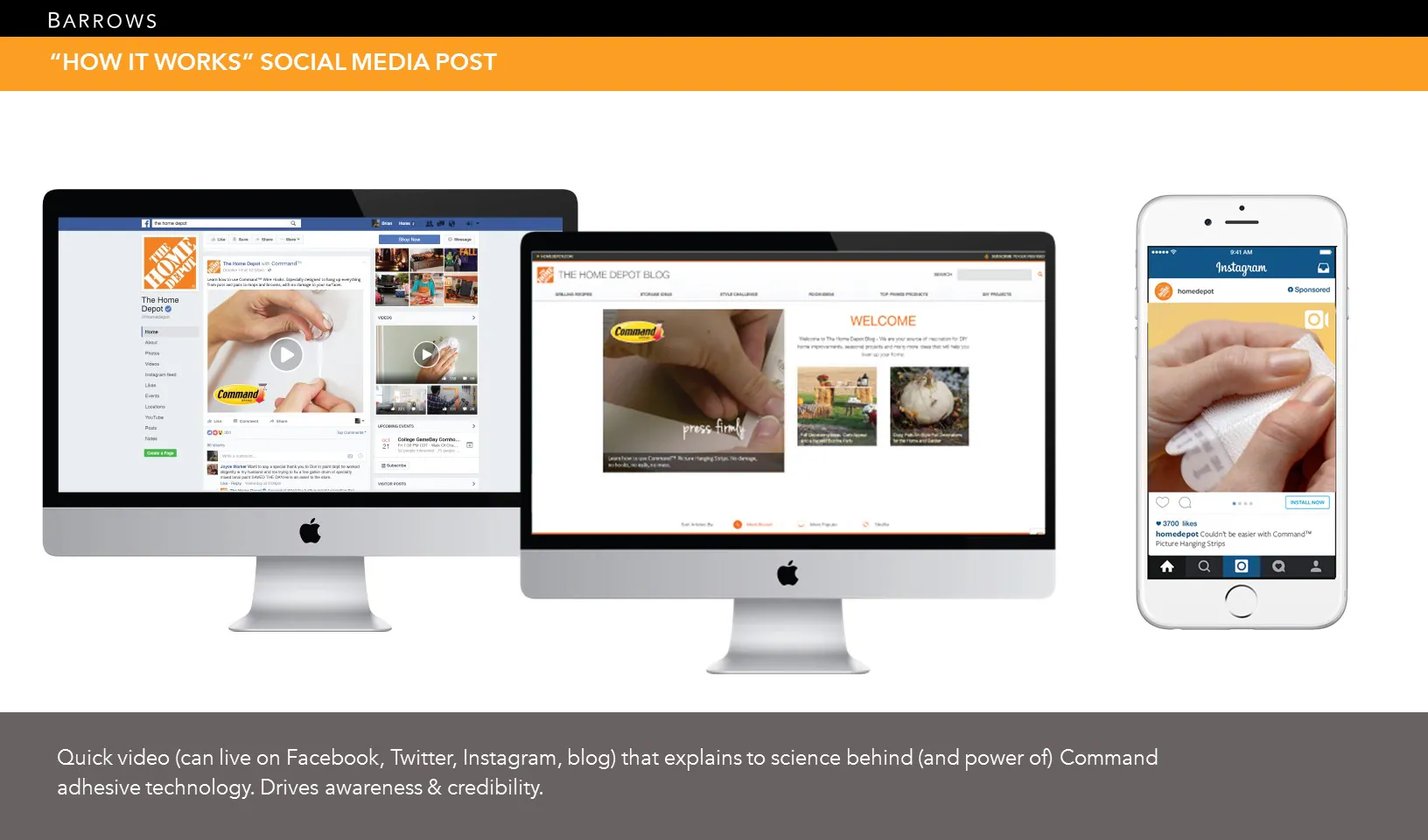
The communication framework carried that logic into the fixture: inspiration first, then product benefit and education, followed by price and a direct reason to choose.
Seasonal Display Concepts
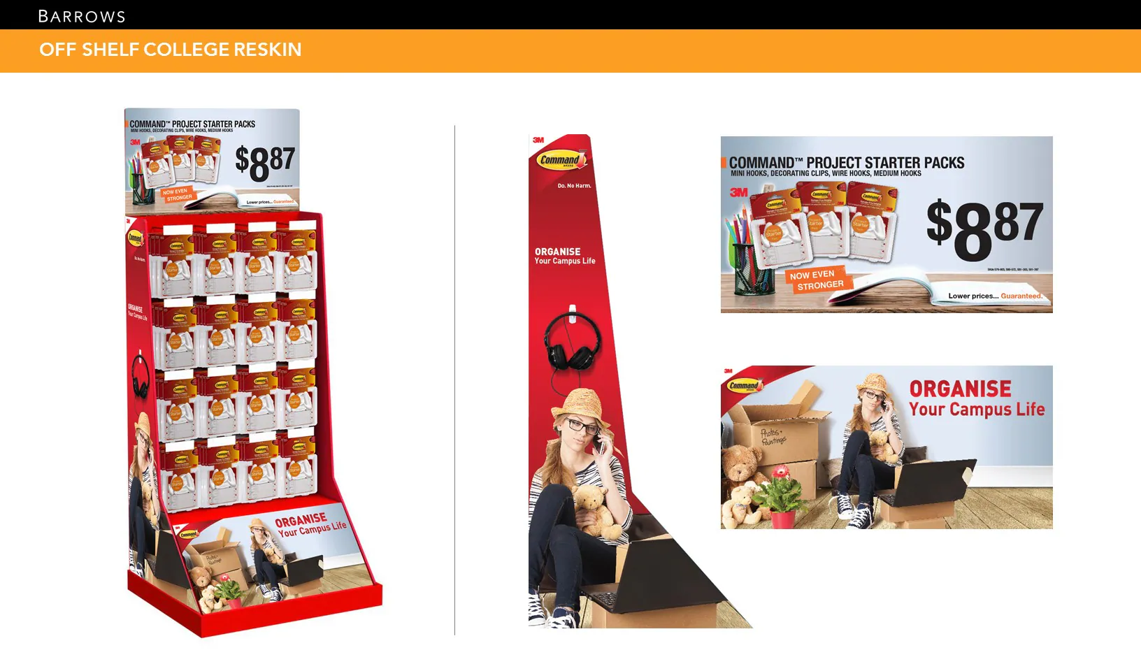
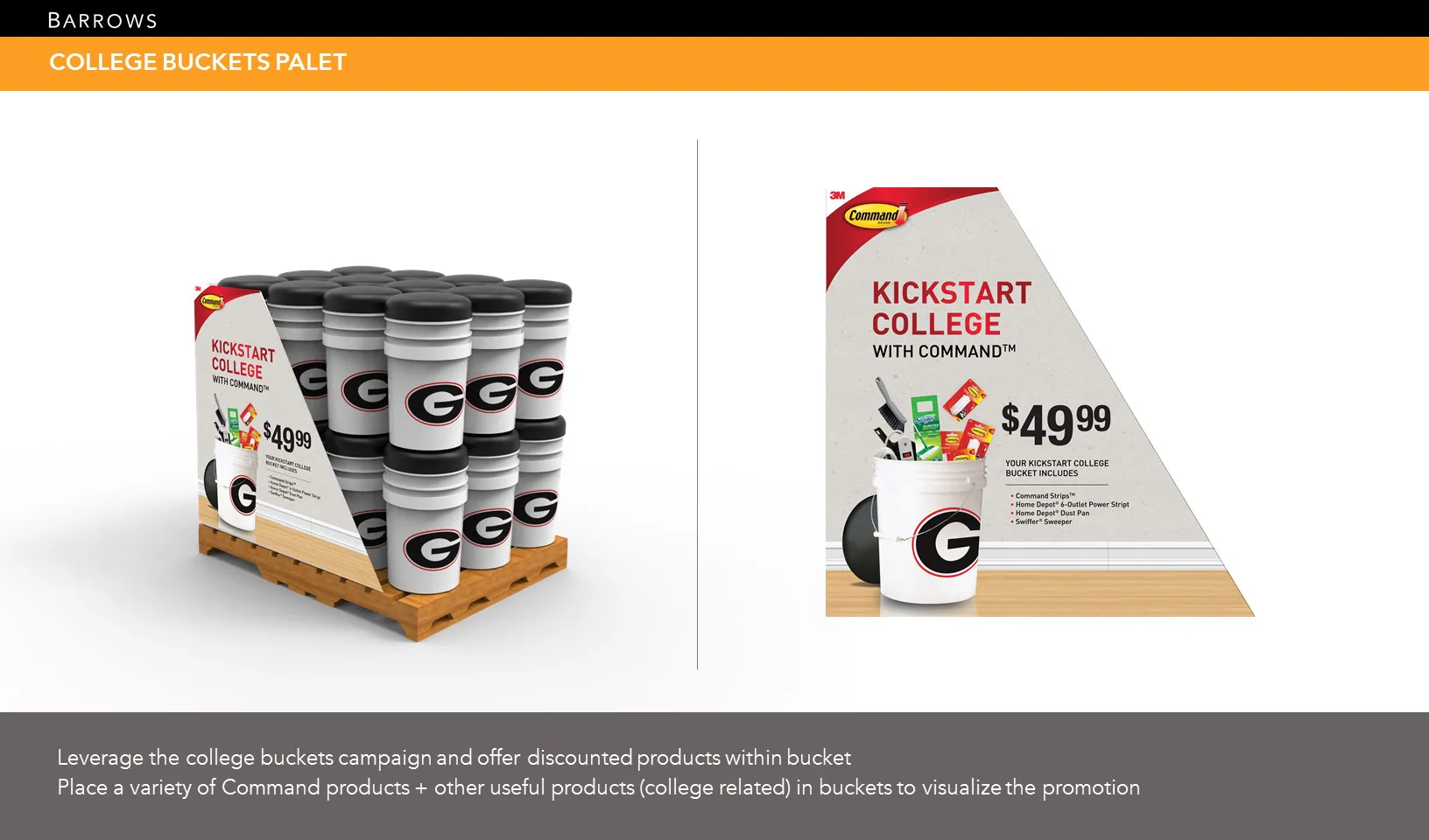
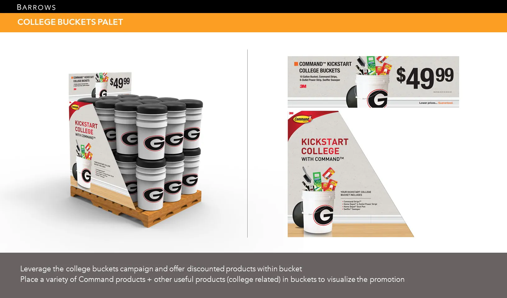
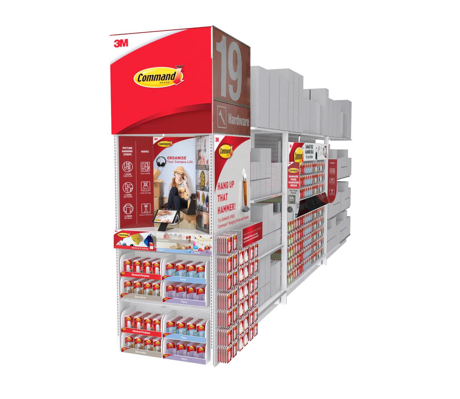
The modular system adapted to seasonal behaviors without losing brand recognition. A college move-in program combined a bold project theme with a compact endcap and pallet display, allowing Command products to appear as a complete room-setup solution rather than isolated hardware.
Endcap and In-Aisle System
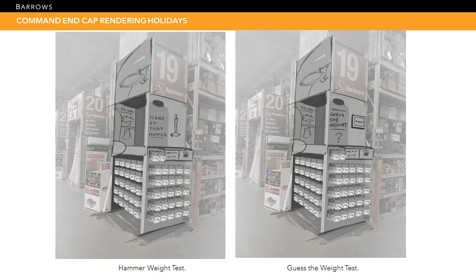
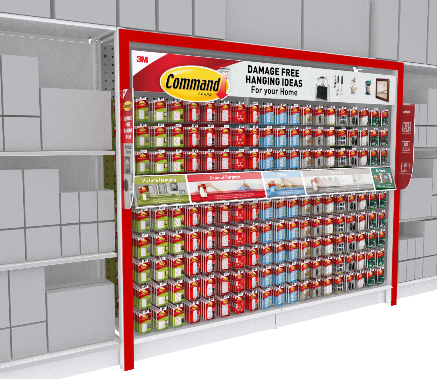
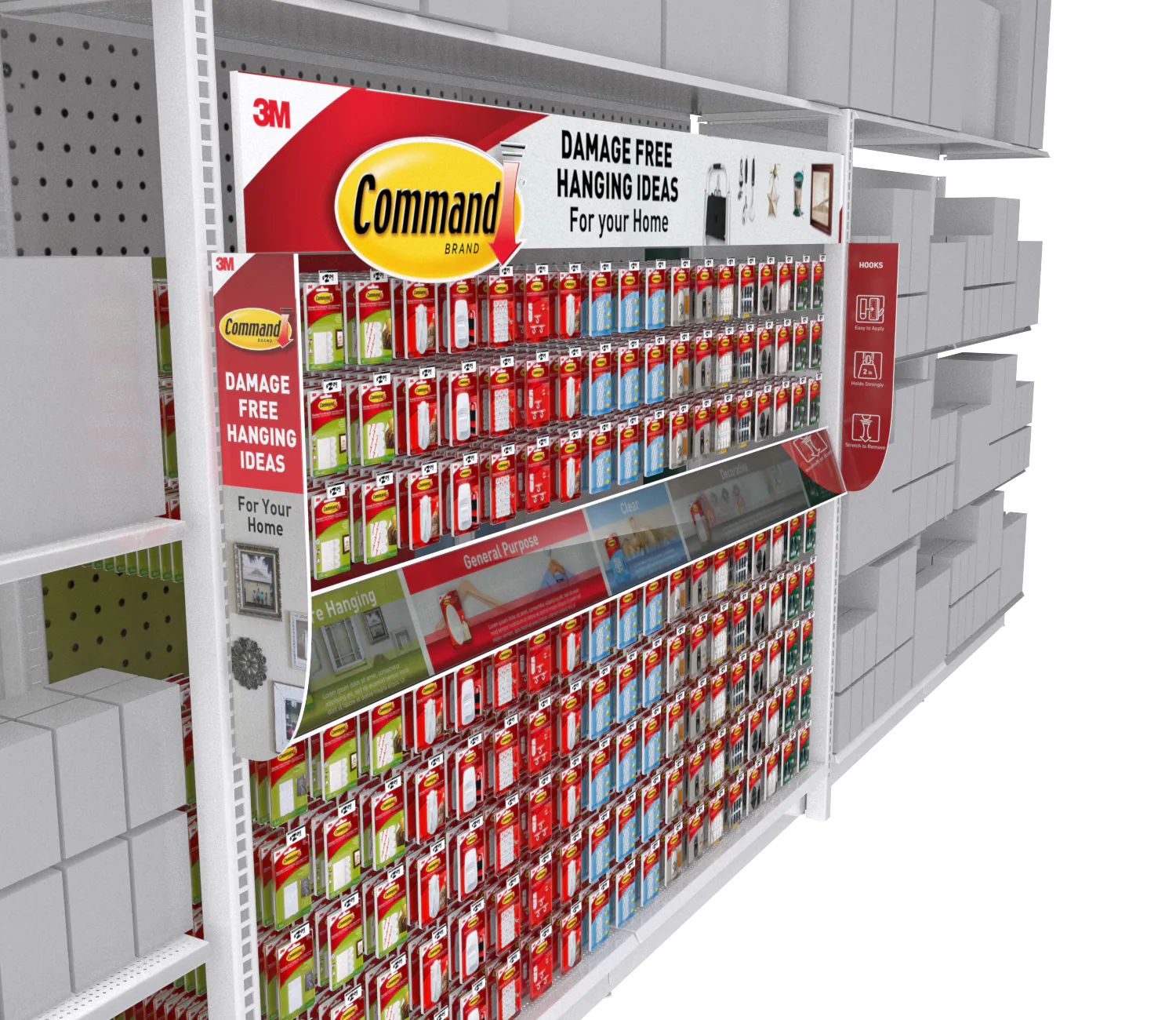
The main retail family used Command red for recognition, Home Depot orange for retailer context, and white informational zones for legibility. Header architecture, project photography, product organization, and navigation blades were designed as reusable components that could adapt to different footprints.
Standalone Activation
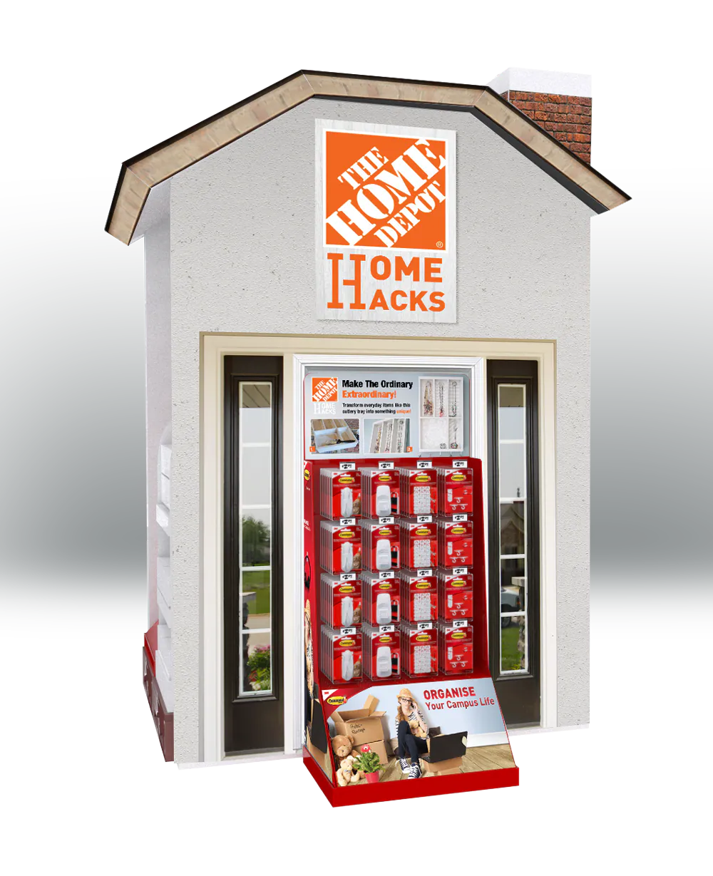
The Home Hacks fixture extended the experience beyond the standard aisle. Its house-shaped architecture made the project idea immediately recognizable while providing space for product, inspiration, and step-by-step guidance in a self-contained footprint.
The Result
The finished system connected brand, retailer, shopper mission, and physical footprint through one modular language. It was designed to scale from content and seasonal promotion into in-aisle, endcap, and standalone displays while keeping project inspiration close to the product decision.