Project Summary
Morgans Hotel Group needed a clearer common thread across a collection of culturally distinct properties. Developed while Morgans was a retained client, this proposed identity reframed the group as a home for the creative class: expressive enough to feel culturally relevant, but structured enough to connect every hotel under one recognizable system.
My Role
As Lead Designer, I helped translate the positioning into exploratory logo studies and two developed visual systems spanning identity, property architecture, editorial design, digital experiences, signage, and food-and-beverage touchpoints.
Project Timeline
- Discovery and Positioning
Review the existing brand, define the creative-class audience, and establish the “Hotels for Creators” opportunity.- Visual Research
Build a visual vocabulary around culture, discovery, artistic expression, and the individual character of each property.- Identity Exploration
Explore a broad range of marks and compositions before developing two systems across the Morgans portfolio.- Brand Applications
Extend the strongest principles into editorial, digital, guest, property, and food-and-beverage experiences.
The Opportunity
The existing portfolio contained highly recognizable hotels, but the parent brand lacked a consistent visual thread. The proposal positioned Morgans as Hotels for Creators—a family of destinations united by curiosity, cultural participation, and a willingness to show rather than tell.
Designing for the Creative Class
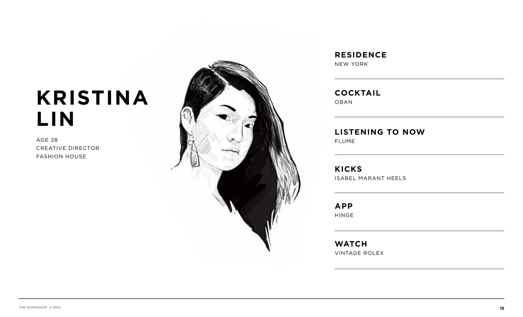
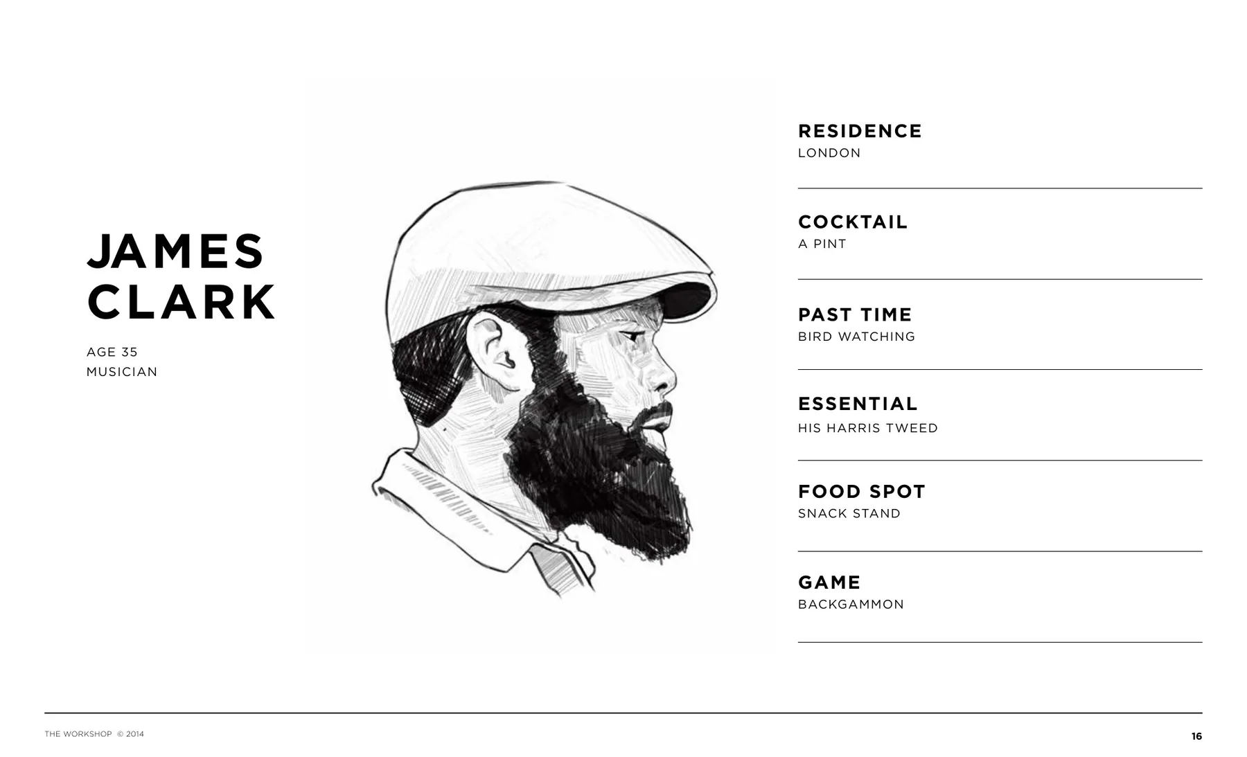
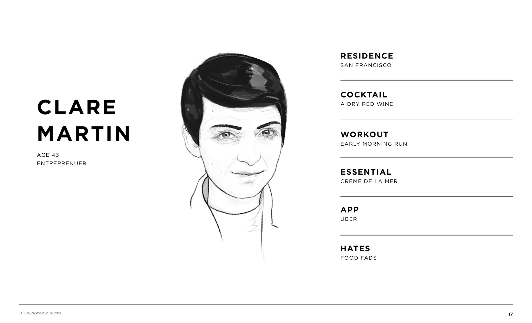
The audience was defined through creator profiles rather than broad demographic categories. These portraits made the strategy tangible, connecting cultural interests, travel behavior, media habits, and preferred experiences to the identity decisions that followed.
Research and Visual Direction
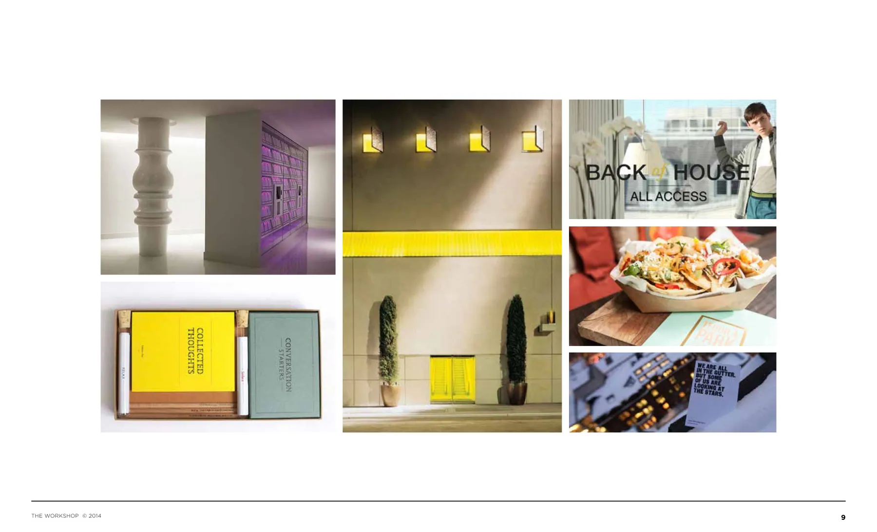
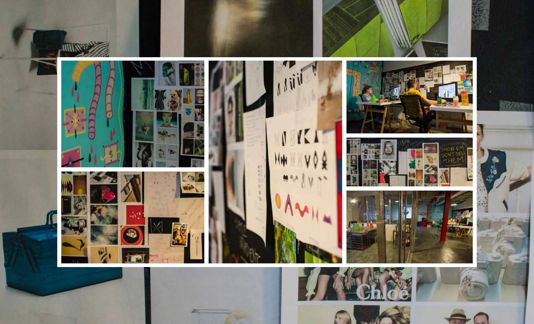
Research moved beyond conventional hotel references into galleries, independent publishing, fashion, music, street culture, and objects that reward discovery. The resulting visual world balanced restraint with unexpected moments of personality.

Early Identity Exploration
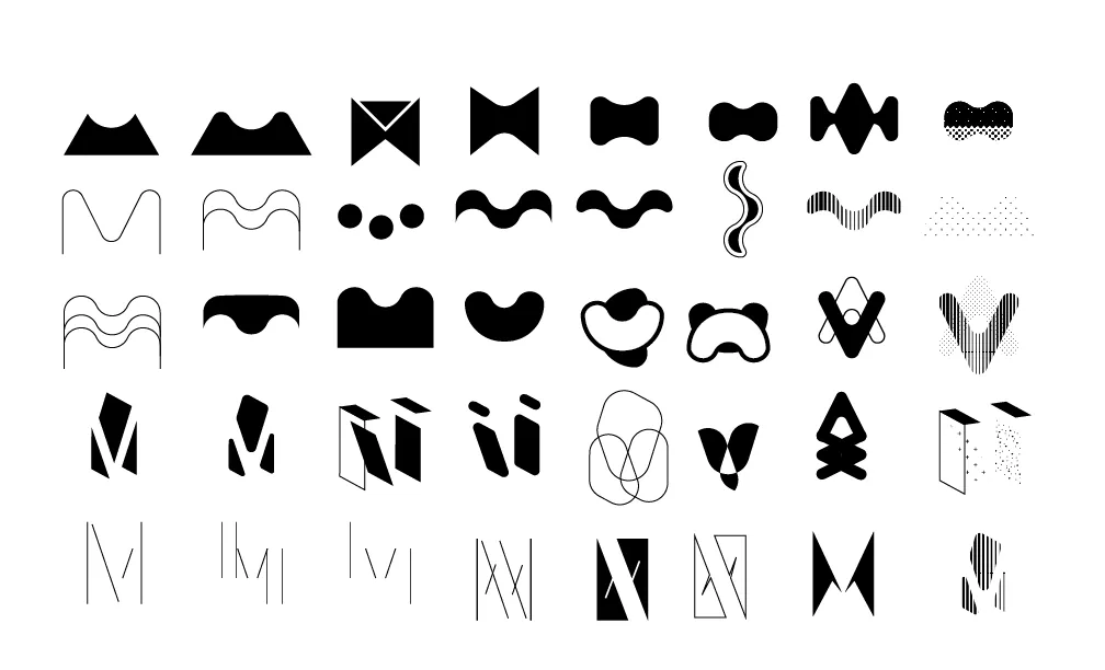
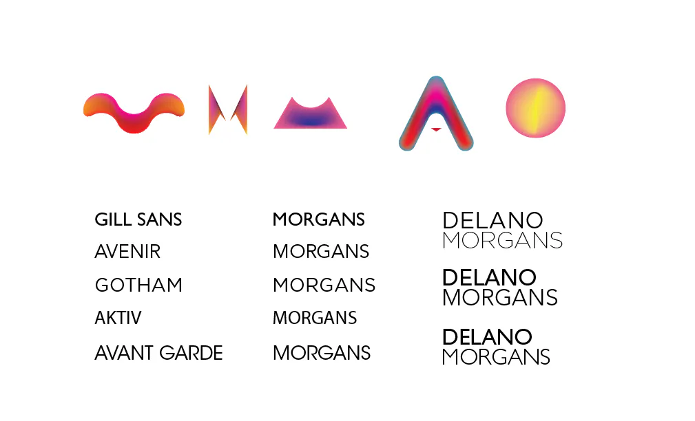
The first logo studies deliberately cast a wide net. Abstract monograms, frame-like symbols, fluid letterforms, and compact property marks were compared in monochrome before selected ideas moved into color, typography, and portfolio naming tests.
Create / Enjoy Layout Development
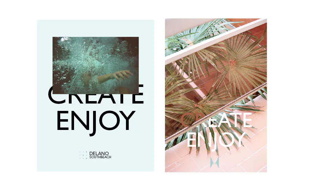
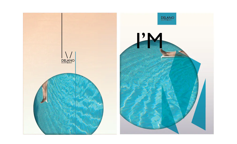
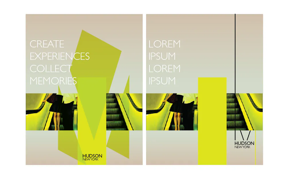
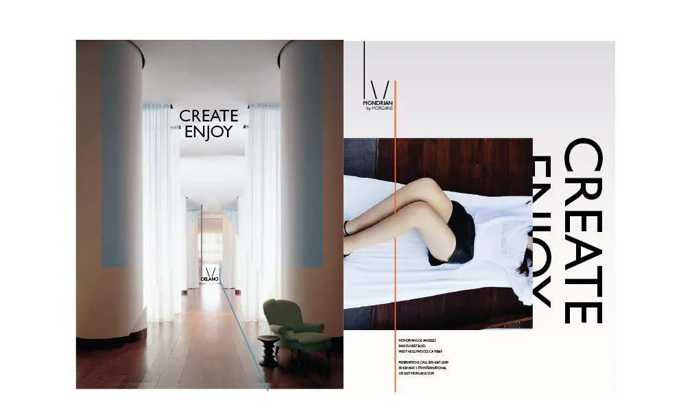
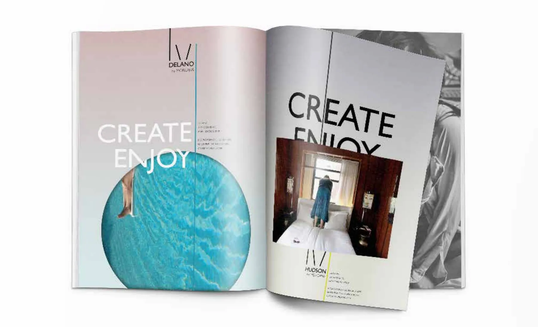
Rough layout studies tested how the emerging system could organize photography, oversized type, translucent color, and property-specific messaging. The repeated Create / Enjoy language gave the work an active editorial voice while remaining flexible across covers, brochures, and guest collateral.
Direction One: You’ve Been Framed
The first direction used a simple frame as a flexible organizing device. It could identify the parent company, adapt to individual properties, crop imagery, structure editorial layouts, and create a recognizable family without forcing every hotel into the same visual personality.
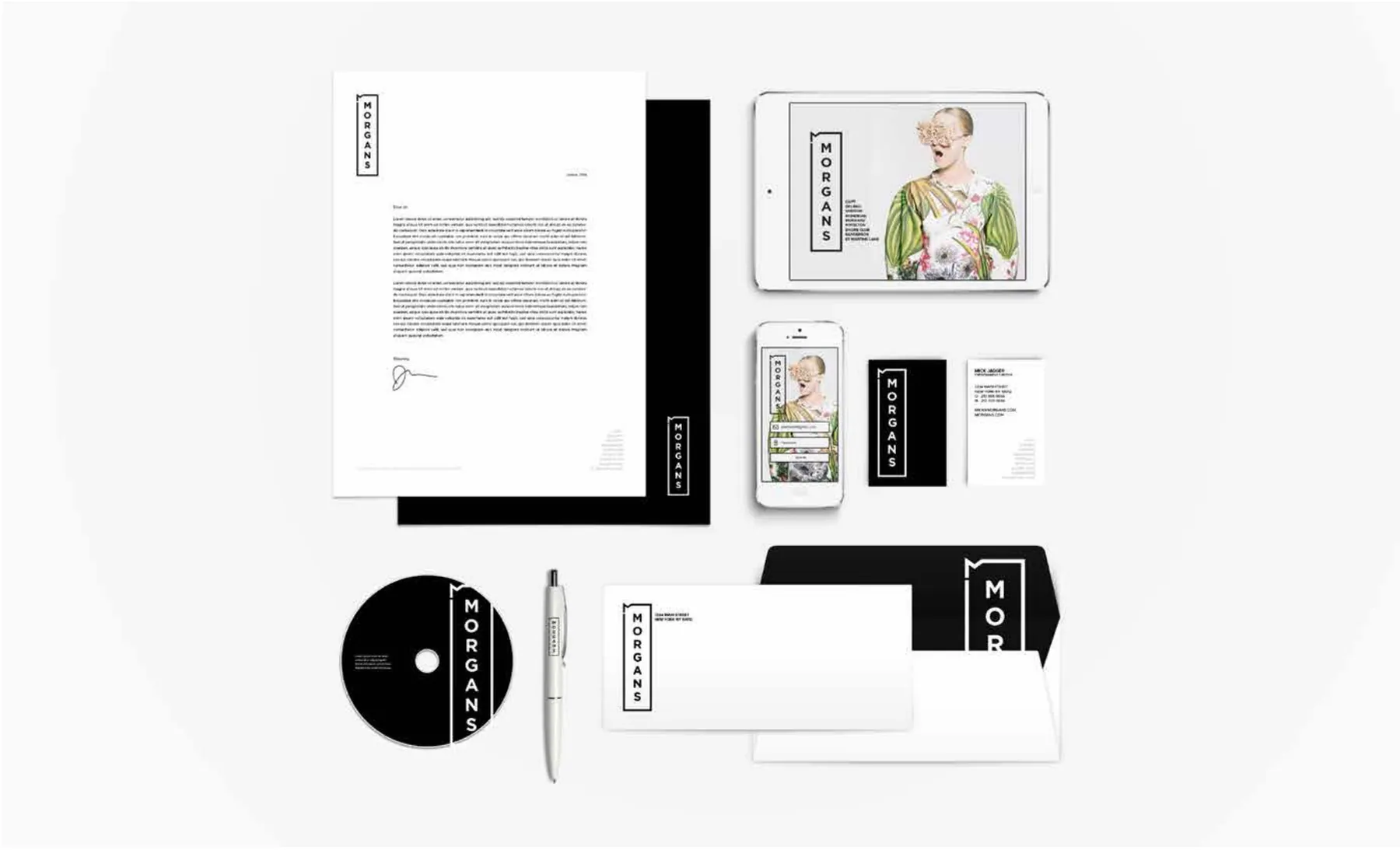
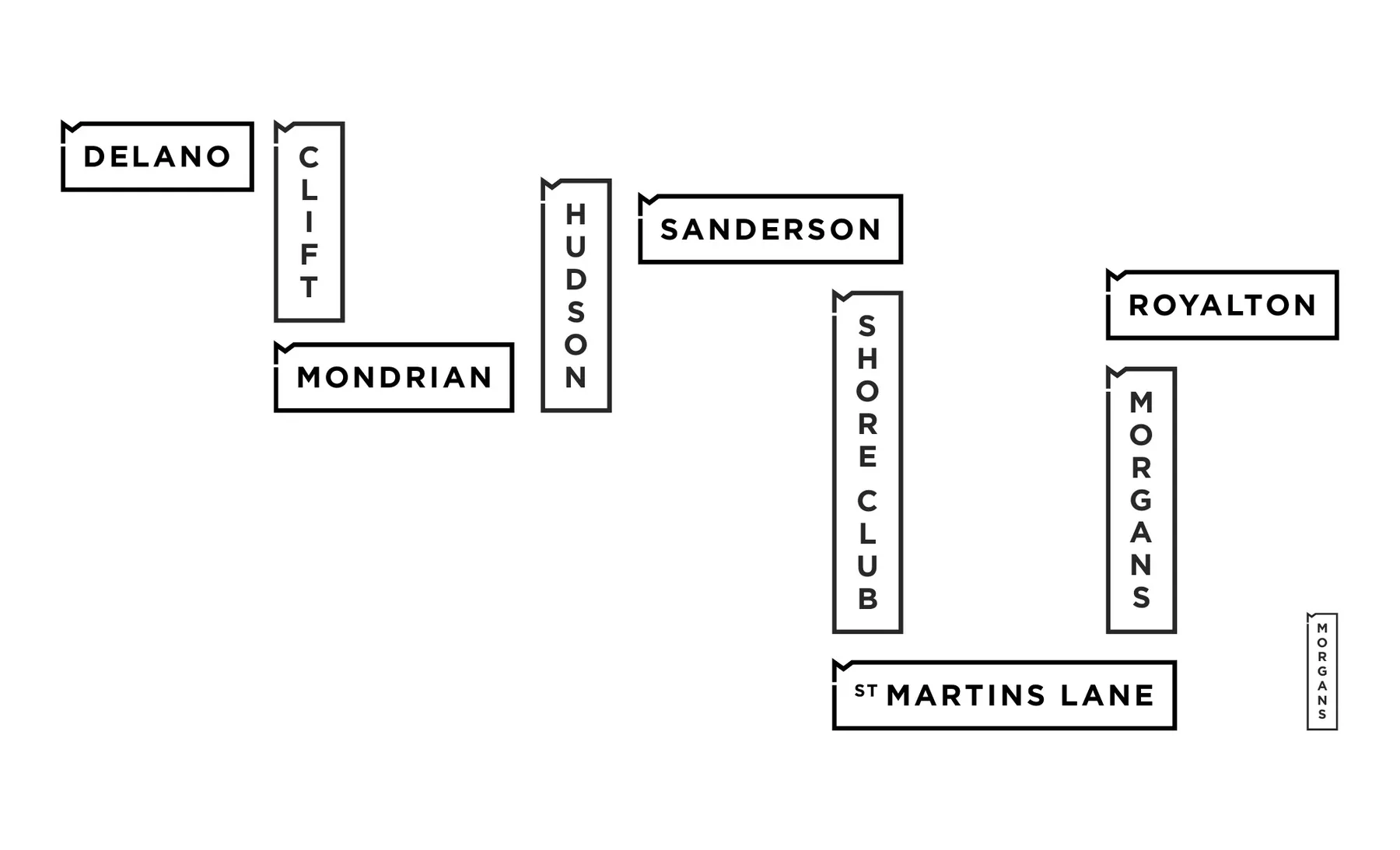
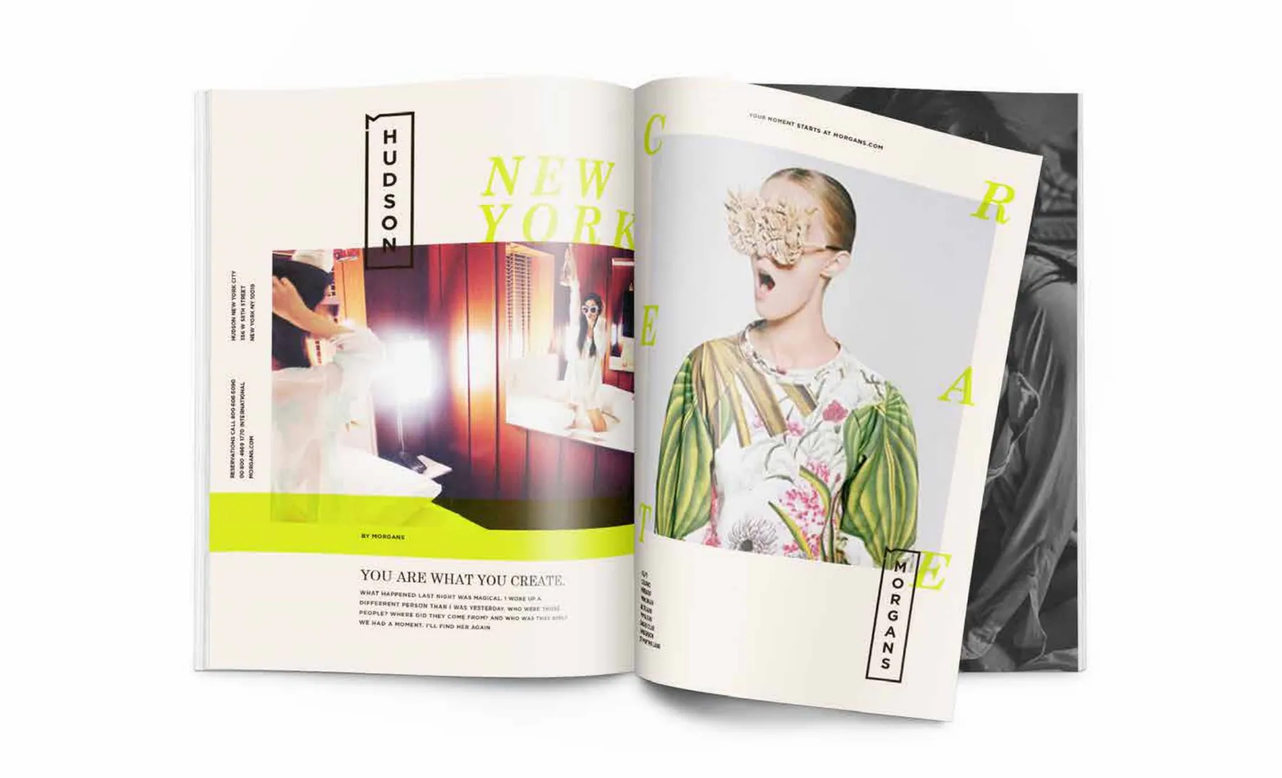
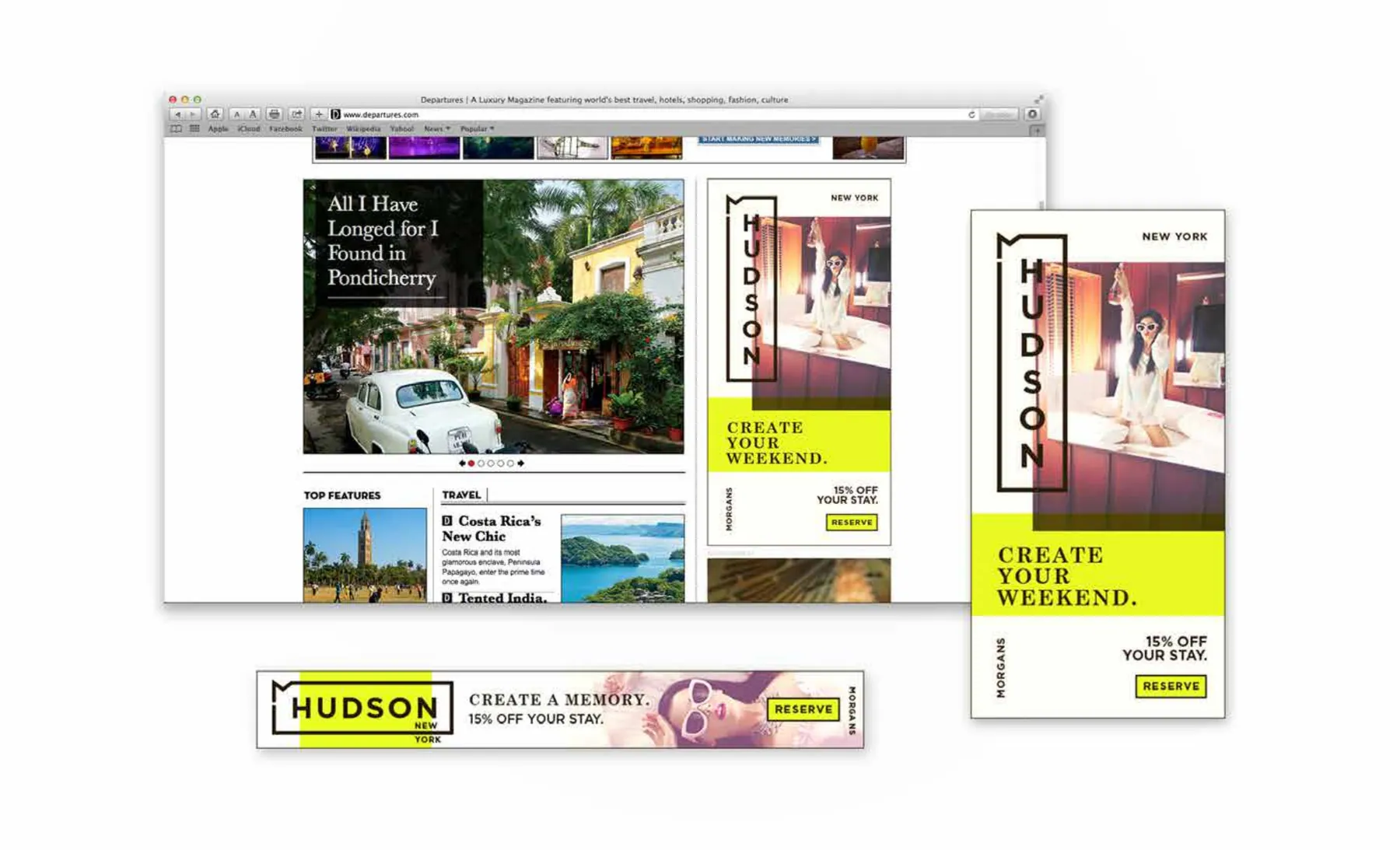
Direction Two: It Starts With a Line
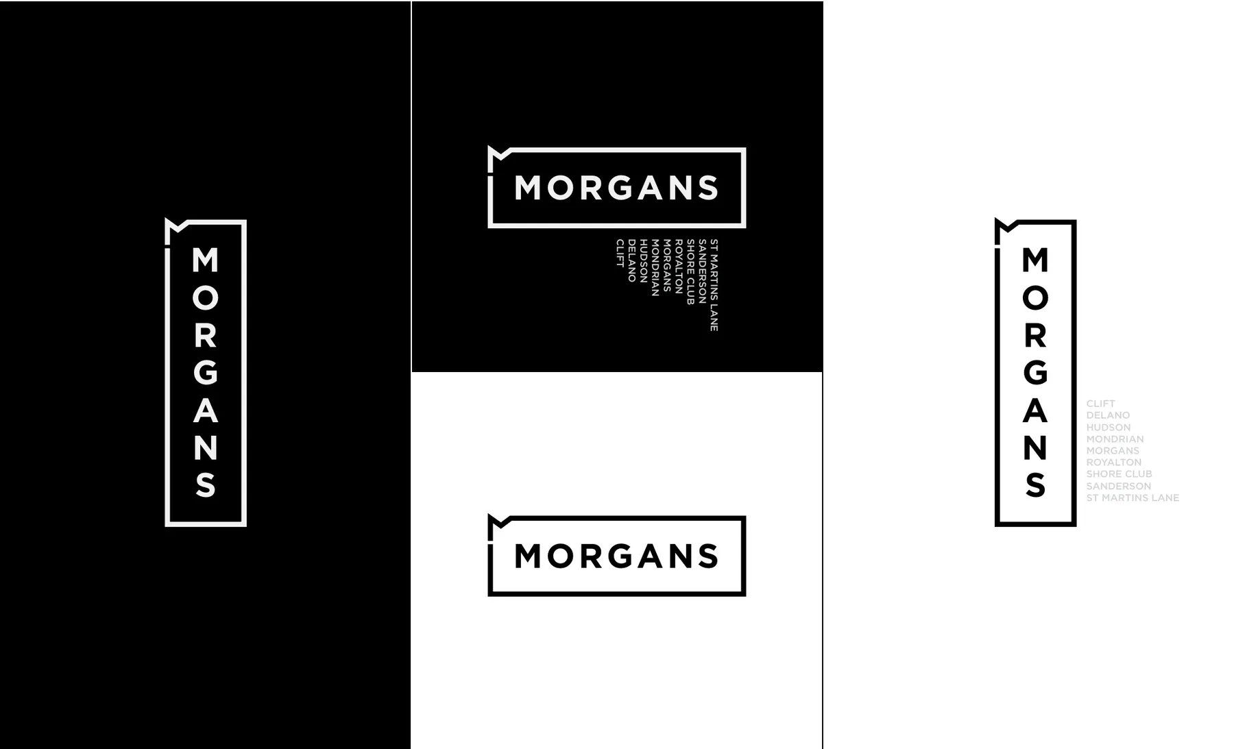
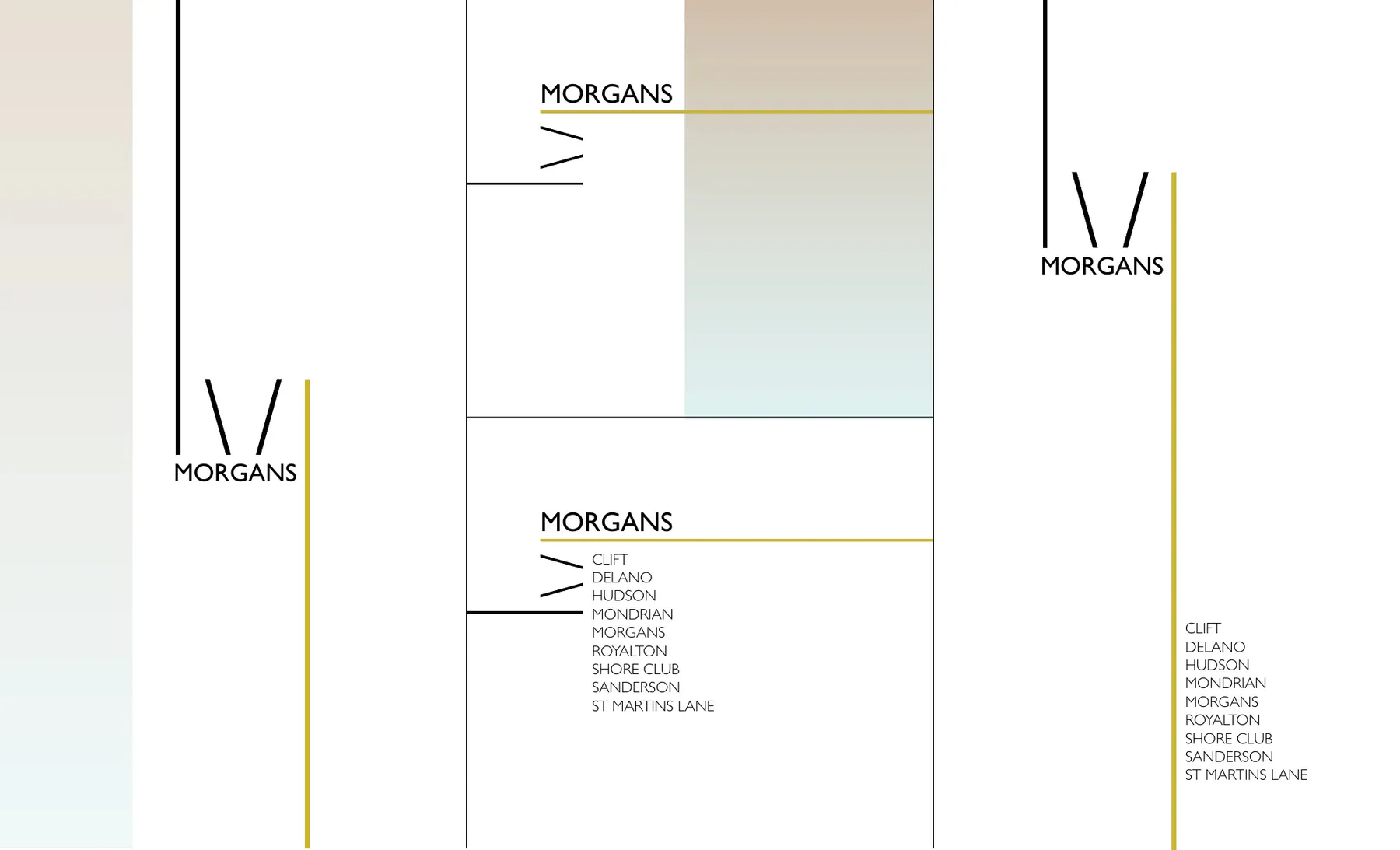
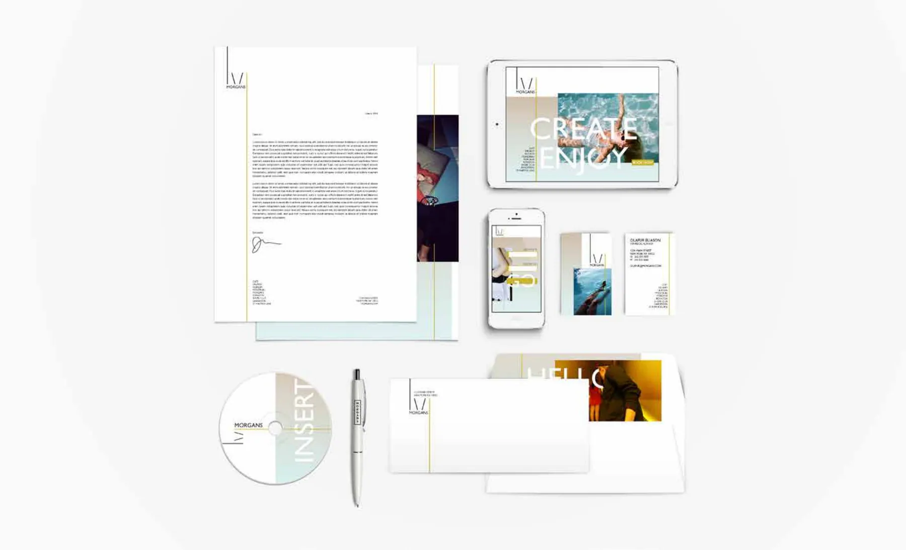
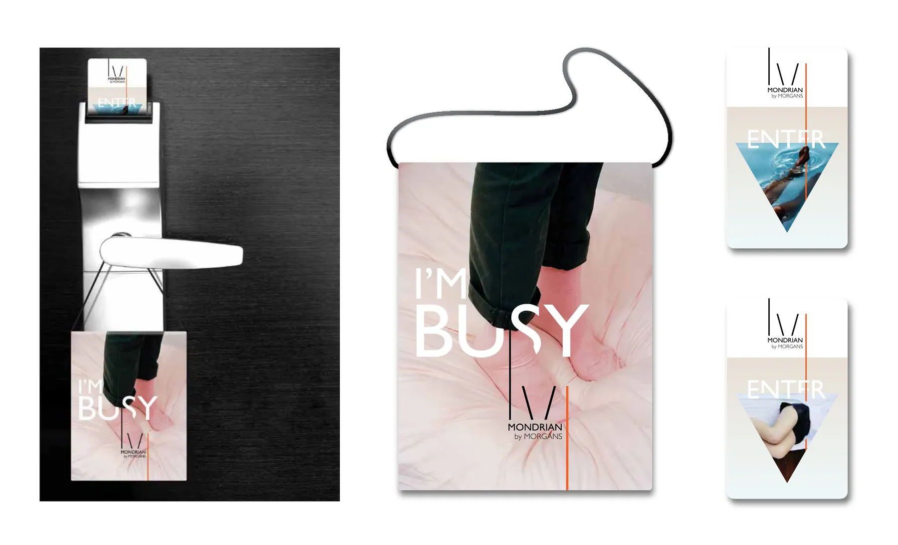
The second developed direction reduced the system to a single line: an architectural gesture that could become a monogram, divide information, frame imagery, or shift in proportion from one property to another. Its restraint created room for each hotel to express its own character.
Extending the Portfolio
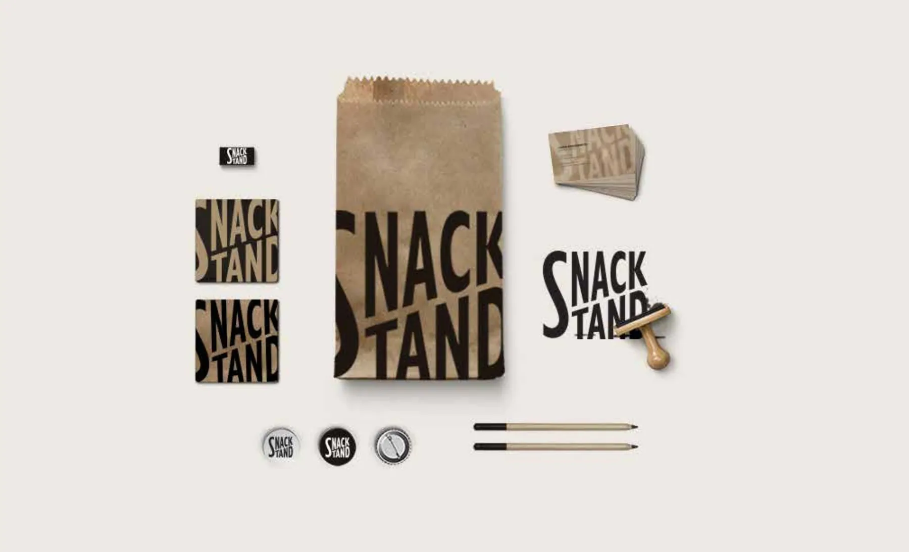
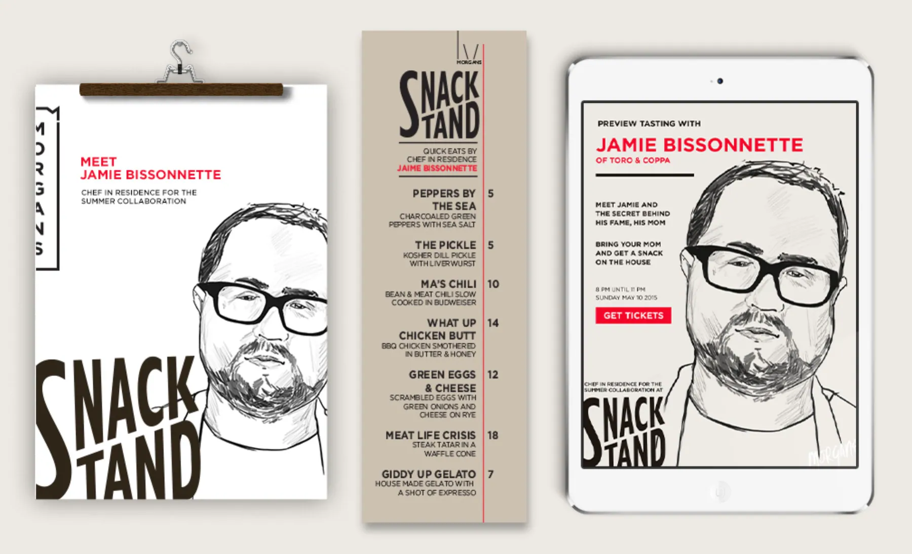
The system was also tested beyond the hotel masterbrand. Snack Stand demonstrates how a food-and-beverage concept could retain its own tone while still feeling connected to Morgans through typography, portraiture, editorial structure, and an intentionally tactile application system.
The Result
The proposal demonstrated that consistency did not require uniformity. Each developed direction created a recognizable Morgans framework while leaving enough flexibility for Delano, Hudson, Mondrian, Royalton, Sanderson, and the wider portfolio to retain their own cultural voice.